12 TIPS FOR TERRIFIC CARDS!
1. Be clean! Keep your hands and work surface clean. Keep your tools clean and free of smudges (ink pads, markers, etc.).
2. Be smudge-free! Make sure your ink is completely dry before closing your card. If you do have smudges on your card, try to remove them with a white eraser like Stampin’ Up! Pastel eraser. If that doesn’t work, re-do it. It’s only paper!
3. Bling! Add something special to your card, but don’t overdo--clean and simple is beautiful. A little bling goes a long way!
4. Be sharp! Make sure your cutting tool is sharp and not fraying the edges of your paper. Use a sharp scissors for cutting ribbon so it does not fray.
5. Little things mean a lot! Cut ribbon at a pretty angle when finishing your card. Be sure to line up your edges so your images are straight and even. Blush the edges of cardstock to create depth and interest. Need help with blushing? Just ask!
6. Quality shows! Always use high quality cardstock (80 lb. paper is ideal). Your paper should have a nice, smooth surface to accept the ink. If your image doesn’t seem dark enough, your paper may be the problem. Envelope quality matters, too. The difference will show in your finished product.
7. Image is everything! Be sure your stamped image is sharp and clean. If not, re-do it. It’s only paper! If you consistently get a poor image, check your stamp and your paper to determine where the problem is. If the stamp is damaged, don’t use it. If the problem is your paper, you need a better quality cardstock.
8. Detail! Detail the inside of your card. Include an extra layer, blush the edges, stamp an image that coordinates with the front of your card, etc., but avoid lots of shapes or busy lines. Place your sentiment just slightly above center for the best presentation.
9. Decorate! Decorate your envelope to match your card. Keep it simple, though. Do not put anything on the outside of the envelope that might get caught in postal machines.
10. Be Postal friendly! If you are using buttons or brads, be sure they will not poke through your envelope in the mail. If they might poke through or prevent the envelope from lying flat, include a piece of bubble wrap inside your envelope to protect the card and get it safely through the post office machines.
11. Final look! Take a final look at your project when complete. If it doesn’t meet the above criteria and have a professional look, make changes!
12. Break out! Do all of your cards have a similar look? Break out of your comfort zone and try a different technique!
Your extra effort will show in your beautiful, professional-looking card!
Thursday, September 23, 2010


Tuesday, August 17, 2010
Back to School
Sorry it's been so long since I posted anything, but I've been kind of meeting myself coming and going. Today I take my son back to Mizzou for another school year. Tomorrow the local schools start and my other son begins high school!
Yesterday the group Circles of Care Ministry stamped cards at church and we created some lovely designs to send out to congregation members who need a smile. Some of the cards will be available for sale. We are getting ready to launch our Christmas card marathon. We will make sets of 10 Christmas card sets to sell at our fall sale. Proceeds go to help those in need in our congregation and the local community. I will post some of these designs in the near future!
See you soon!
Yesterday the group Circles of Care Ministry stamped cards at church and we created some lovely designs to send out to congregation members who need a smile. Some of the cards will be available for sale. We are getting ready to launch our Christmas card marathon. We will make sets of 10 Christmas card sets to sell at our fall sale. Proceeds go to help those in need in our congregation and the local community. I will post some of these designs in the near future!
See you soon!
Saturday, July 31, 2010
More Goodies to Share!
Here are some more of my new favorites. I'd love to know which ones YOU like the best! If you have a favorite, tell me!
 Happy Bird-day! This is one of the really fun cards! I sent it to my Aunt Phyllis for her birthday. It uses such fun, bright colors! Can you pick them out?
Base: _____?
Textured layer: _____? Embossing Folder: ____?
Stamped images on: _____?
Designer Paper: _____?
Ribbon: _____?
This should be a super easy quiz. If you couldn't answer any of these questions, you need to spend more time with your catalog!


Base: _____?
Textured layer: _____? Embossing Folder: ____?
Stamped images on: _____?
Designer Paper: _____?
Ribbon: _____?
This should be a super easy quiz. If you couldn't answer any of these questions, you need to spend more time with your catalog!

This is a lovely but simple wedding card made with Woodland Walk Designer Paper. I plan to do lots more with this lovely paper. It just has a beautiful, peaceful feeling about it. This design just looked like a bride's boquet to me.

This is a fun, bold card!

Hee hee! This card started out to be my masculine card!!! Can you believe how it turned out? It just goes to prove that the card really does create itself. You are just the tool!

And I have saved my favorite for last! I know, I know, lots of them are my "favorite," but although this card is super simple, the colors and the message just pop for me! I hope you enlarge the image on your screen so you get the full effect. This is the outside. . .

. . . and this is the inside. What a wonderful mesage! It would be great for graduation or new job or any encouragement for a major step in life. Hey, you know. . . what about a wedding? Hmmm. Think about it. Why do wedding cards have to be all bride and groomy? This would be a great message for a new couple starting their life together! Just imagine the possibilities . . .
I hope you've enjoyed all the new cards. Goodnight for now. Be sure to tell me which card(s) your favorite!
Friday, July 30, 2010
A Few New Cards For You
 |
The Key to My Heart is Love! Because I Care (totally CASED)   with Greenhouse Gala Designer Paper in an easel card. I also used the Perfect Polka Dots embossing folder and the Scallop Trim Border Punch. Oh, yeah! The flower is the Simple Flower Embosslit, and the buttons are the Brights Designer Buttons. I just love all the cool new buttons and brads! I think a little *bling* can just make a project! 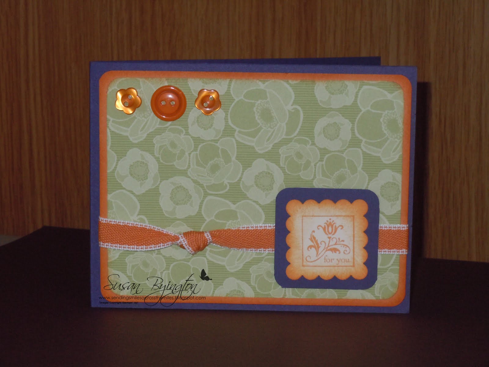 Just for You Cute by the Inch with Greenhouse Gala Designer Paper, Concord Crush, Pumpkin Pie & Whisper White paper, Brights Designer buttons, and Peach Parfait 1/2" Stitched Poly Ribbon. Tip: Pumpkin Pie and Peach Parfait are perfect complements to each other!   A couple more cards CASED from the catalog!   |
Tuesday, July 13, 2010
Vacation
Hi! I'm on vacation in the beautiful Smoky Mountains in Tennessee visiting with all my family. There are 62 of us in all! Only a few didn't make it for the reunion vacation. Just spent the entire afternoon stamping with my Aunt Phyllis. LOTS OF FUN!!! We have made some darling cards to share. Will post them when I get home. Check back next week! :)
Thursday, July 1, 2010
Today was the kick-off for the new Stampin' Up! Idea Book & Catalog! What a fun time we had working with the new colors and stamp sets! I finally got my Big Shot, so that was a fun new toy also! Woo Hoo! Everyone left with lots of goodies: Designer Paper, Stamps, Coupons, Paper Samples, and their own personal Make & Takes.
I am extending my special hostess offer to you . . . If you host a workshop before August 31, in addition to all your other hostess gifts, I will also give you a FREE Color Coach! (minimum sales of $200) You need never be intimidated or confused by color again. The new Color Coach is filled with helpful combinations.


I am extending my special hostess offer to you . . . If you host a workshop before August 31, in addition to all your other hostess gifts, I will also give you a FREE Color Coach! (minimum sales of $200) You need never be intimidated or confused by color again. The new Color Coach is filled with helpful combinations.

Here is one of the cards I showcased. This is made from the beautiful Level 1 Hostess Set, Because I Care.


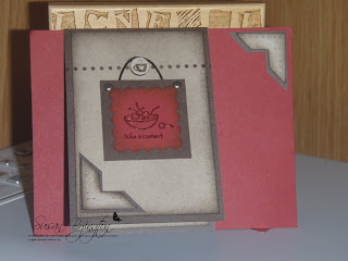
This is another one of my samples I showcased. This card uses the Level 1 Hostess Set, It's The Thought, from the Summer Mini-Catalog. Note the cute little coffee cup at the top. That is from the Itty Bitty Bits set, punched out with the small circle from the Punch Pack, and mounted on one of the Bitty Buttons.
Sunday, June 27, 2010
NEWSPRINT DP SNEAK PEEK

Here is one more sneak peek of a card made with the new Newsprint Designer Paper, Cherry Cobler Textured, Crumb Cake and Basic Black. It is simple, yet fun and works well for masculine birthdays. The owl is from It's The Thought Hostess Set, Happy Birthday is from Fundamental Phrases, and 4 You is from the Tiny Tags Set. I used Early Espresso ink to add a little dimension and "age" to the lighter portions of the card. I would love to hear what you think about this card and the others I have posted here. Please send me any comments you may have! The feedback is very helpful.
Subscribe to:
Posts
(
Atom
)


 Posts
Posts


